Norrköpings Hamn –
The Port of Norrköping
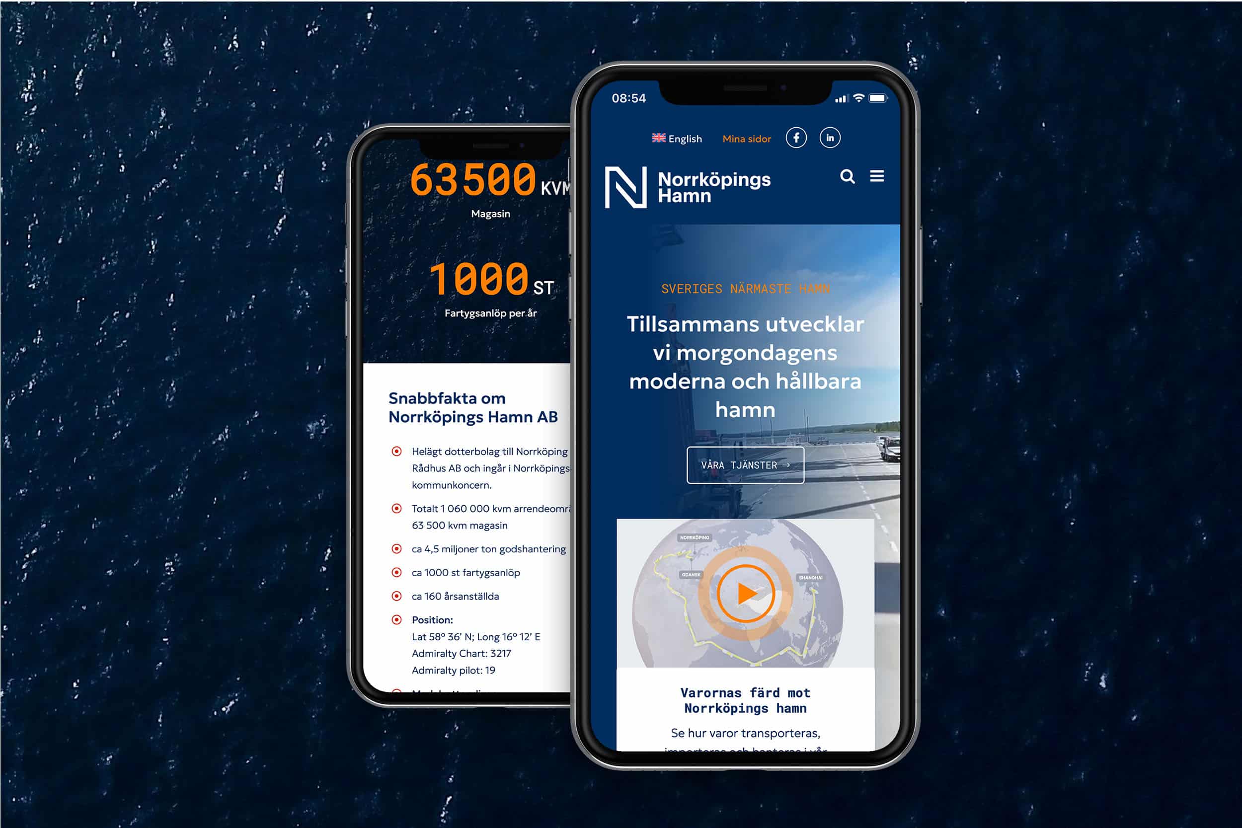
The aim of the new website for Norrköping Port was to show that it is a logistics hub that enables efficient transport. We also needed to package the website in a way that caters to everyone’s interests. Both new and existing customers with different needs should be able to find what they are looking for, the general public should be able to access important information, and potential employees should find Norrköping Port an attractive employer.
In terms of design, the aim was to create a professional and reliable feel without coming across as stiff and boring. To achieve this, we started with the Port of Norrköping’s blue base color, which was darkened and complemented with an accent color in bright orange, just like on the classic protective equipment. We also used large images, straight lines, and the port’s characteristic patterns for a modern and stylish look.


Are you interested in something similar?
My name is Elin and I have been the lead designer on this project. I would be happy to help you find a similar solution tailored to you and your business. Get in touch and we can discuss it further!


